October 3, 2017
RIP, Tom Petty…
This week I’m at the United Way’s Finance, Talent, and Technology Management Forum in Dallas. It’s my first time here — the UW has recently added “Technology” to the roster of this conference, and it’s been a wonderfully refreshing opportunity to learn and discuss all the big-picture tech issues, unburdened by a specific software focus. I’ve enjoyed my time at the Andar Conferences in years past, but I think I’m going to hand that off. As we grow as a technology-enabled organization, I want to share the wealth and let my team have more opportunities to network and learn from their peers in the system.
One thing to mention is Workplace by Facebook. We’ve been playing with a pilot of it since last week, and it’s proven to be a great way to share information with the conference attendees. The interface is easy…it’s Facebook but in a walled garden. I’ve tried to evangelize the Office365 tools, but folks seem to have a visceral dislike to Yammer, and the new Microsoft Teams has an uphill climb because….Facebook. Everyone knows how to use Facebook. And should UWW roll it out as a network-wide tool, I predict it will quickly supplant other methods that never quite caught on.
A great deal of the talk and scuttlebutt here has been about Project Rubicon, the Digital Systems Operating Group (DSOG), and all the ways in which we should migrate to a single platform. I’ve written about it earlier, so I’ll not repeat myself. In the long run, I do believe that it will be the inevitable future…but a change of that magnitude either requires pain or an undeniable pull towards the Cool New Thing.
DSOG and Rubicon are SalesForce-based. I’m not opposed, but it reminds me of my days in higher education IT: everyone ran headlong to SCT Banner (now Ellucian). Not a bad product, but not for everyone. Everyone’s at different points on the “data maturity scale.”
Instead, I want to share more about the Tulsa Area United Way’s data migration path, and how “knowing thyself” is letting us become more conversant in our own data. By knowing our own data better, we’ll be able to “answer questions we don’t yet know how to ask.”
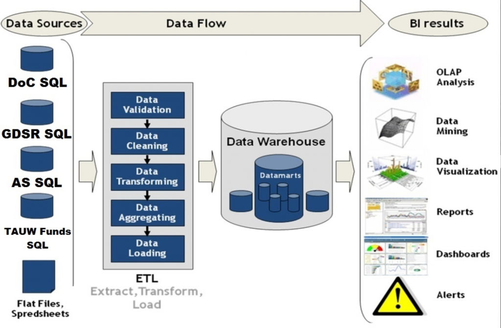
Our effort is DAAV — Data Analyst and Visualization. I’ve talked about it recently in my State of the Union Post. But I want to give more history of how we got here.
A couple of years ago, our Community Investments (CI) division began the migration to Apricot: a web-based tool to build new web forms for our Partner Agency yearly applications, our Day of Caring app, and others. It was a classic victory of style over substance; sales over capability. The sales folks said, “Yes, we can do that.” But once our CI folks got in and got dirty with it, we realized that the tool wouldn’t do what we wanted, so we pulled the plug.
Unlike every other United Way, we’re different in that we have an “in-house partner” called the NTech Collaborative: which has worked closely with our Community Investments process, and built the following web apps:
- Day of Caring (begun in 2002) — replaced a giant whiteboard and allowed CI staff to better assign company volunteers to projects on our
 yearly Day of Caring. As an aside, our Day of Caring is enormous; over 400 projects and over 5,000 volunteers on a single day
 - GDSR (Geographic Distribution of Services Report — 2003-2004). Enables our partner nonprofits to enter/describe their services mapped across our 5-county service area. This DB also contains local census data, and over time has developed into the freshest census data source for our area.
- Agency Speaker Requests (2005) — a blend between Community Investments and Campaign, this lets us our nonprofit content experts register their availability for company campaign events. This is an important part of our business — we continually stress that employee meetings and personal storytelling is vitally important to maintaining the vitality of our campaign.
- TAUW Funds Allocation (2009). The yearly application process for our nonprofits. This is the 900-pound gorilla that replaced GIANT printed binders that our partner agencies HATED to fill out, and our volunteers HATED to carry. We HATED the cost of printing and maintaining these. This DB is opened to our Community Investments panels — a group of ~170 community volunteers who fan out each year to interview/assess the partner agencies. This activity provides the “audited” numbers to build the campaign goal each year, based on what the community volunteers feel need to be accomplished.
As you can imagine, all these apps have been tweaked, revised, and otherwise updated many times over the years. But they’ve always been discrete apps, with their own back-end SQL databases. Reporting was largely canned. Until this year, with DAAV.
DAAV started off as the NTech Collaborative saying to CI — we feel your pain resulting from the Apricot debacle, so let’s roll our own. The initial effort was to combine all these 4 apps to write to a single data warehouse in the cloud. The front ends remain separate, with their own security, etc.
In addition to providing this data to CI, our other goal was to open up the nonprofit data to the agencies who own it — let them be able to query their own data, compare their results to their peers, etc. in near-real-time. The tools we found in this space (like Tableau) were lovely, and also pricey — plus, they’re designed from the outset to PROTECT one’s access to secure data. You know, like in the private sector. We, in the nonprofit realm, have a different agenda. We want to share our data with partners, funders, collaborative groups, etc.
Enter local development firm Xenolytics Data Services and their XenoComm tool. XDS has been an NTech Collaborative vendor partner for some years — they actually wrote a fair amount of the 4 web apps.
So rather than pull all this data into Andar, we perform Data Mining Operations to pull relevant donor data into DAAV, where data maps are being written between the various sources and fields. The XenoComm tool is web-based, which gives us flexibility in deploying dashboards as we go forward.
Our first deliverable has actually not been in CI, but in support of the 2017 Campaign: for the first time ever, we have the ability to produce a “leave behind” document when visiting a company CEO that describes not only his company donor status, but accurately pulls data from Day of Caring participation, their employees’ work in our Women’s Leadership Council or Emerging Leader’s Society, and Alexis DeToqueville Society.
As we’ve learned to map the fields, it has exposed long-hidden errors in data entry and collection — we’ve been able to go back to our Campaign folks and have them help clean up their data. It’s a miracle, I tell you!
As we get more conversant with the tool and the capabilities, we’ll continue to plumb the depths of our data. For our recent IT Committee meeting the DAAV team produced a set of graphs on a dashboard related to our Live United Network over the past couple of years of existence.
We’re only at the beginning stages of the process, but even if it’s never a universal panacea it’s the right thing for us, right now. And since hiring our first-ever Data Manager this Summer, we now have someone who truly owns our data. And we’ll get better at determining what we need to pull from Andar and stuff into the data warehouse, which are skills we may need in the years to come.
[…] Which brings us now to the Future: Data Analysis and Visualization. […]
[…] a Grand Unified Field Theory from national leadership. A new modern system, built in the cloud, where everyone (at least the big 400 anyway) can migrate […]